 iTunes
  Download
  Del.icio.us Pod-safe music generously provided by Sonic Blue
![]() In late January I had the pleasure of attending the VizThink conference in San Francisco. As an Information Architect I wanted to learn how to use different ideas around design to assist me with “big IA” and “little IA” projects. The folks kind enough to join me in this conversation include:
In late January I had the pleasure of attending the VizThink conference in San Francisco. As an Information Architect I wanted to learn how to use different ideas around design to assist me with “big IA” and “little IA” projects. The folks kind enough to join me in this conversation include:
Christopher Fuller Griot’s Eye
Daniel Rose Bell Canada
Ken and Rebecca Hope Motive8 Infographics
Noah Iliinsky Complex Diagrams
We discuss:
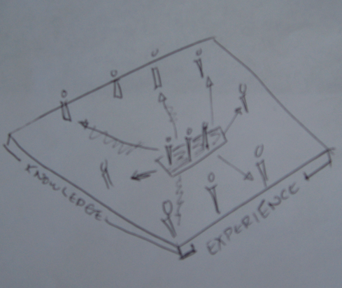
*Thinking outside the box* Daniel Rose talks about why the process of “thinking outside the box” isn’t possible unless you surround yourself with people of different experiences. The following framework is what Daniel sketched during our conversation that describes his idea.
*Graphics empowering people* Ken Hope from Motive8 Infographics points out that a lot of the visualization tools empowers people to communicate ideas more clearly, without having to use words.
*Global Perspective* Noah Iliinsky and Rebecca Hope talk about the diversity of professionals, both within and outside of the design disciplines in attendance, and how the sharing of different perspectives added even more to the conference itself; backing up Daniel’s perspective of thinking outside the box. (In fact, 21% of the participants were from outside North America.)
*Common Craft* One of the many presenters at VizThink were the founders of Common Craft, Sachi LeFever and Lee LeFever. Rebecca points out that the end result is brilliant, but not knowing the work that goes into creating these simple, yet elegant videos, is common amongst clients.
*To Write or not to Write, that is not the question* Daniel points out the genius behind Common Craft is the writing or scripting of the videos that make Common Craft remarkable. Writing and illustration go hand in hand.
*KISS* Taking the time to reduce the noise will help your users understand the core message – whether it’s in design or writing to help guide the vision.
*Want to see more of VizThink ’08?* There were several photographs taken by professional and amature photographers while at the conference. For most of the photos, check out Flickr and search on the key word “vizthink08”.
*Examples of Design*
The following are images were created by Christopher Fuller; Ken and Rebecca Hope; and Noah Iliinsky. For a full size version of this art work, simply click on the image.
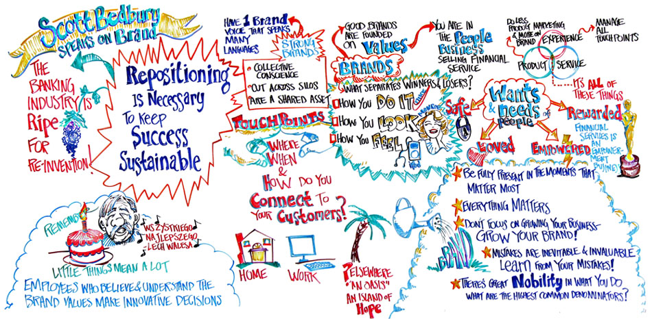
*Christopher Fuller*
This is a recent live illustration record I did of a dialogue on branding (The original is 12.5′ X 6.5′) that was given to a European banking client by Scott Bedbury – a former Nike and Starbucks marketing executive.
Just a little note of clarification on why I drew Lech Walesa in the bottom left corner. Mr Bedbury told a story about Lech Walesa coming to the United States to give a talk at a conference. One of the employees at the hotel saw Lech’s name in the register as a featured speaker and decided to google him. They discovered that his birthday fell on the same night as his speech, and so they arranged for the hotel wait staff to learn how to wish him happy birthday in Polish. According to Scott, it brought Lech to tears. It was a great story and one I knew I had to capture.
I do have the ability to do a reasonable caricature of Lech Walesa on the fly being a child of the 80s, history buff, and someone who gobbled up pop culture (um, there’s a prominent nose, moustache, etc.). But I don’t know how to write “happy birthday” in Polish. So while scribing the conservation I whispered to a colleague to google how to write the phrase and slip it to me on a post-it (I took my cue from Scott Bedbury’s story and copied the initiative of the hotel worker). By the time the conversation was over I had written “Wsystkiego najlepszego Lech Walesa” on the graphic. Of course, this went over well (though I think it’s not 100% right) since the meeting was in Europe and there were a few Polish participants in the audience.
*Ken and Rebecca Hope*
This infographic is a classic example of a “before” and “after” and shows why we love what we do! The client, Ifor Ffowcs-Williams, CEO, Cluster Navigators Ltd, is an international cluster development consultant.
In his workshops Ifor’s verbal communication is eager and interesting. However, his key presentation tool detailing the underlying process just didn’t do him justice as a typical Powerpoint slide. Although he is a visual thinker and speaks using lots of imagery and analogies, his presentation slides were all plain written text (even though occasionally highlighted for effect!) and didn’t capture the excitement or essence of what the process involved and offered. Also, when used with audiences with limited English, the text-based slides were not always understood.
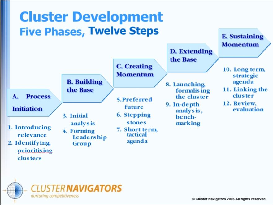
Essentially we brought the Cluster Navigators process to life. We visualised the process as a fun and dynamic journey, using simple imagery for each key stage to help audiences quickly understand the concepts and engage in the process.
The impact of the the infographic is probably best described by Ifor himself in this feedback he provided, “Why didn’t you show us this before?’ was the question from one of their Scandinavian clients on seeing our new infographic. “We’ve now used it in workshops and conferences on five continents. It’s brought out the smiles, made the learning more interactive and led to repeat business.”

*Noha Iliinsky*
This diagram has been arranged to show not only the hierarchy, but also the intended use pattern of a typical, linear, non-fiction book.
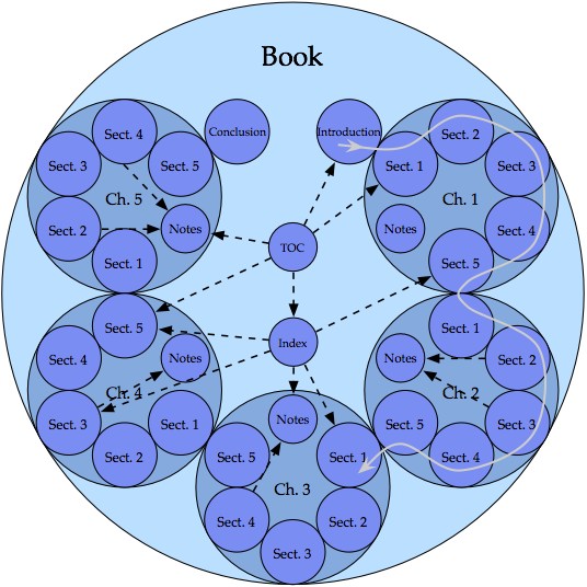
* Continuity in the book is indicated by contact of the circles.
* The gray line, progressing in small and large clockwise arcs from section to section and chapter to chapter, demonstrates the linear progression of the content.
* The dashed black arrows show some possible non-linear paths that may be traveled by the reader to view content that is not part of the main linear flow of the book.
The goal of displaying the use of the book, and not merely the hierarchy, has led to an atypical diagram that conveys more knowledge than the typical counterpart.
I created this diagram in the fall of 2003. It appears in my thesis, and was selected to be supporting material for the book The Practical Guide to Information Design, by Ronnie Lipton.
Transcript of Using Design Visuals To Communicate Ideas A Podcast from Vizthink 2008
[music]
Jeff Parks: This podcast is brought to you by TechSmith. Right now, millions of peoples are snagging. Are you? And by, the IA Summit. This year, your peers and industry experts will speak about how topics such as social networking, gaming, patterns, tagging, taxonomies, and a wide range of IA tools and techniques can help, as users experience information. For other events happening all over the world, be sure to check out evensts.boxesandarrows.com.
In late January, I had the opportunity to attend the VizThink Conference in San Francisco, California. VizThink brought together some of the most creative minds in design from around the world. On the last day of the conference I gathered together Daniel Rose from Bell Canada; Ken and Rebecca Holt from the New Zealand based infographics company, Motivate; interaction designer Noah Alinsky, and illustrator and designer Christopher Fuller from Griot’s Eye.
We cover a range of topics, including “How to truly think outside the box, ” “The power of illustration and design in communicating ideas, ” and personal highlights from the conference. Many thanks to everyone for participating in this discussion, and I hope everyone enjoys the podcast. Cheers.
Jeff Parks: I didn’t really have a theme for today. I thought maybe we could just talk about lessons learned, why people are here, and what they’ve learned, what they’ve enjoyed about the VizThink Conference, in general. Maybe we can go around there and everyone can introduce themselves to start, and maybe, the company you’re working for, and what you do. Can we start over here?
Christopher Fuller: I’m Christopher Fuller. I’m from Los Angeles. I work for Griot’s Eye. It’s a huge vast company of one.
[laughter]
I network with friends a lot of times on bigger projects, but I do graphic facilitation, live illustration. My background is cartooning and caricature, which I usually do in Orlando. And I came into this because of MG Taylor Corporation, which was a boutique consulting firm that put an ad that they needed some artists. And I was like: “Why would consultants need artists?” And that began my journey.
Jeff: Cool, excellent. And you’ve enjoyed the conference?
Christopher: I did. I loved it. I knew that there was a community out there, but I was in a bathtub, sliding around. [laughter] And I came here and I was like, “Wow, there’s an ocean!”
[laughter]
So, it was great.
Jeff: Excellent. Rebecca.
Rebecca Holt: I’m Rebecca Holt, and I’m from Wellington, New Zealand, all the way across the Pacific. And my husband and I work in a company called
Motivate Infographics, which has been recently launched. After five years of playing around with infographics and the need for them, and clients that we could help communicate with, or for. And we launched Motivate at the end of last year, and most of the work we do is with the New Zealand government, where they have excessive documents, and reports, and processes which aren’t understood in your words. We go in and add the concept to our process and make them visual. People can quickly and clearly grasp the main points of anything.
The conference has been great. Same reason. New Zealand’s a very small country, a long way away. But it’s nice to be able to come and connect with other people who are also converted over.
Ken Holt: Well, I’m Ken Holt, the other side of Motivate Infographics. I too, by coincidence, come from New Zealand.
[laughter]
Noah Alinsky: I’m Noah Alinsky. I’m between projects right now. I’ve most recently been working as an interaction designer, which is what I went to graduate school for. But, accidentally, in the course of my studies at graduate school, I wrote a 90 page thesis about, how to draw good diagrams. And the basis of that is… the short version is that intentional choices are more powerful than arbitrary choices. So, the process steps you through the choices that you make when designing a diagram, or a visual representation, and how to make those good choices, based in cognitive psychology, and how people perceive things, like shape, and placement, and color.
So, at the end of the day, what you get is a product that is an information product that’s useful to your audience. And mostly, I’ve done work applying that to qualitative things: to pictures of relationships. But the same concepts are completely valid also for any kind of quantitative, numeric representation. So, I’ve spent a lot of time thinking about that.
Daniel Rose: My name is Daniel Rose. I’m from Toronto, Canada. And I work for a company called Bell Canada, big phone company. You may have heard of it.
[laughter]
You’ve heard of it in New Zealand. Alright, that’s good. I work with large groups, around specific business objectives, to coalesce the energy and passion, and wisdom of those groups and put it together into something that is useful for organizations. What I would call a ‘tangible work product’, that is created quickly, in real time, with the knowledge and expertise of everyone in the room.
Jeff: I know the one thing I was talking to you guys earlier… one thing that I really got out of this conference as an information architect, is really wanting to understand, how to better design ideas; better design products and services. Like Rebecca, I work with vast, huge volumes of data, trying to structure and label things so people can easily find them and then move their way through a process, whether it’s on a website, or otherwise.
There’s a lot of tie‑in: interaction design is very much like that. And I just found it really interesting with the different workshops, the way in which people would do things. I attended Daniel’s session this afternoon, and Christopher was trying a lot of things brilliantly, and we got to interact with everything from Play Dough to cut and paste of Styrofoam balls.
You don’t really think about these things that, I guess I would have used in grade one and grade two as a way of working with large companies, to try and illustrate ideas. He gave a great presentation today, Daniel, and again, it’s just thinking outside the box a little bit more, in terms of presenting ideas.
Daniel: I have some thoughts on that box, too.
[laughter]
Jeff: OK, well let’s hear them.
Daniel: Sure, alright, we’ll make it quick. So, I would suggest that thinking outside the box is not actually possible. The box is what it is. So, when people are asking that; asking to get that, I’ll define the box, first. In my humble opinion, the box is defined by: the boundaries of the box are the collection of our knowledge and our experience. That’s the box. So, when you’re looking for creative or breakthrough ideas, what tends to happen is that people tend to get with like‑minded people. And, they tend to be with small groups of people, as well. They don’t want 50 people looking for breakthrough ideas, because that’s unmanageable.
So, they get in a room with five people who are just like them. So, the collective box is the sum total of that knowledge and that experience, which is really, ultimately, quite small, because they’re all the same. They’re all say, “Telecom people.” They all went to the same university, and they’ve all worked at the same telecom for 20 years. So, the potential for breakthrough ideas is limited.
So what you need to do then is you need to…and I’ll draw it out. This probably won’t help for you podcast listeners.
Jeff: We’ll take a picture of it and put it up on the show notes.
Daniel: All right, perfect.
Jeff: No problem.
Daniel: So if you get a bunch of people together who are all kind of similarly minded, there’s your box. If you get a bunch of people together who are all very different ‑ artist, sculptors, musicians, different industries, different places on the earth, different ages ‑ that becomes the size of your box. And the potential for creativity and innovation is when these people start to talk, and they start to share mental models, and they start to rebuild mental models based on the unpacking of their assumptions and rebuilding it. So that’s where your potential for innovation and creativity can occur. The thing is it takes time.
Jeff: Right.
Daniel: So if you’re talking with a nuclear physicist about what they mean by the word “merger”, they’re going to be talking about the coming together of electrons and atoms or whatever, and it’s going to mean something completely different to a business person. And then you start to unpack, OK, well what does it really mean? What does it really mean? What does it really mean? And then you can start to co‑create together. So then you can have the insight and brilliance of a physicist to help you work through your corporate direction with ideas and perspectives that you never would have come up with on your own.
Ken: Might start a completely different change of direction which the businessman’s never even contemplated before.
Daniel: Exactly. But this takes time. The act of these different parties coming together to exchange and unpack their models is a time consuming process. So you have to think about, is that a good investment. Is the challenge that I’m currently dealing with significant enough that I need to invite physicists and sculptors in order to really get into it? If you’re just looking to redo your something or other, how do you bring people into the company through a website…maybe you don’t need that. You just need to think about what your objectives are.
Rebecca: And out of interest are you seeing more and more companies willing to take that step to want to bring in outsiders and such who might not know anything about the business but then are actually, OK, let’s go for it. Let’s see what can be possible. Let’s see what ideas we could come up with.
Daniel: It’s getting there. I think that’s almost the most extreme manifestation of that. I’ve worked with some clients who instead of doing that, instead of inviting the sculptor and the physicist in, they take a whole day to rethink their business processes after reading for a couple hours about complex adaptive systems. So we’ll have people reading about how coral reefs manage resources and how rainforests do the same. And that’s one way to substitute for actually getting a marine biologist in or something like that.
Ken: It’s kind of like what Tom was saying that it’s almost a poor substitute because you look up on the Web for this sort of information, and you’re still using your assumptions and your box view. Whereas if you’re actually sitting in a whole room of people, that’s like you said, they could have done this all over the Web. But the scope of what we’ve done and what we’ve learned and the enthusiasm could not be captured through a single conduit like that.
Daniel: Yeah, it’s a continuum and you just have to figure out where the payoff is.
Ken: Time is the cost of getting these ideas but wow, look at the directions you could go in.
Jeff: Even from a human factors perspective, your brain is made up of two hemispheres and we tend to not really exercise the one half very much, in our professional lives in particular. And I think that’s the one thing that focusing on design more for solutions can really help with because the more you engage in creative processes, the stronger your logic becomes as well, in very much layman’s terms but that’s the general idea. And so if we had companies that were more involved to be, looking at Chris’ illustrations for example ‑ we’ve got to get pictures to put up on the podcast. You’re an absolutely brilliant artist. When we were here the first night…
Christopher: Go on.
[laughter]
Christopher: That’s good, that’s good, yeah, yeah.
Daniel: Yes.
Christopher: Griotseye.com.
[laughter]
Jeff: I resemble that remark. But you are. You’re absolutely brilliant. And looking at your illustrations the other night you could just tell. I didn’t need to say anything. You could just look at the illustration and you could just envision exactly what you were thinking. The whole conference blew me away in terms of the unbelievable talent that’s out there. And we’re not alone, right?
Christopher: I think that’s the real power of when you add the visual modeling element. When people see ideas that they’re saying coming to life in front of them it’s just such an amazing experience.
Ken: Empowering.
Christopher: It’s empowering, people hear their ideas being captured. And like you said they’re empowered, but also other people can see a pattern emerging, and it’s pretty amazing.
Noah: And that actually leads into something that I was very impressed by is that we’re under this umbrella of visual thinkers, but there’s cartoonists, and illustrators and mapmakers here, the mind mapping people who are very much about the contents and the relationships and not so much about the visual presentation. And I’m more at that end of the spectrum. People who can do all of it…
Christopher: Photographers.
Noah: Photographers. These groups working together and learning from each other. The illustrator is learning to structure and the logical people learning how to draw. I can do a stick figure now, right?
[laughter]
Noah: But everybody being excited about expanding our collective box really to creep in those directions that we didn’t have and having a community to do that in where we to a degree have this common goal of all of us expanding our capability of representing these ideas. Just like you said, being able to turn what’s stuck in our heads into something that we can share in a representative way.
Rebecca: And what’s cool about that also is how many university‑type teaching professionals are here too.
Ken: Oh, yeah, academics.
Rebecca: Covering a couple of educational people who are here to try and learn how to do this. It’s not just professionals in this field. It’s actually companies who want to do better and bring it into the organizations or lecture which I think is brilliant.
Ken: Or people who want to actively pass this on to the younger generation. That’s the kind of energy which I think everyone’s got to take. This is really just a new way of thinking.
Jeff: Because I’m part of a few mailing lists, the Interaction Design Association, the Information Architecture Institute, Taxonomy Community Practice. One thing I keep reading over and over again, which I think is a colossal waste of time, is trying to define the professions, trying to…you know what I mean?
Noah: It’s a thread on the IA list for 10 years.
Jeff:: I’m sick of it. It’s so irrelevant because let’s face it, if I were to draw a picture of what I wanted you to build, and all of the different professions that are sitting around this table, you’d all be able to build it. You’d have a different way of going about building it, but the product or the service or the site or whatever it was, you could build it. So what I really liked about this conference is, here’s an opportunity to learn from people in different areas, like you were all just illustrating, and not focusing on trying to define my own profession. But rather, opening up the doors and learning from others, and then incorporating that into my profession and learning accordingly. And stop trying to get into the semantical details of defining what information architecture is, or what interaction design is. I mean, to me, that just seems like such a waste of, I don’t know, brain power. You know?
Ken: Define through the big picture. Don’t define through the micro‑vision.
Jeff: Right. And Daniel’s big picture as, right? Not the little microcosm of like‑minded people, but all the larger box of professionals.
Ken: The ocean.
Rebecca:[indecipherable 15:27]
[laughter]
Jeff: Yeah, exactly. What were some of people’s favorite sessions that they attended? And maybe a short description of what they were?
Ken: One which I was super impressed with, wasn’t so much the session itself. Because it was about the growth, mind‑mapping. And, you know, he’s just a fundamental, flawless presenter, and he’s so onto it. But then, he, in the very last five minutes of his session, was all about the second life interactive reading environment. And so, he uses this basically to display these panoramic, huge pictures that they create, that they [indecipherable 16:12] .
Here’s a way of, what we normally do, is we draw a two dimensional information graphic. We boil the information we get down to the core message, and display it in a information graphic, that tries to encompass the whole.
Now that’s basically the core message, or the surface structure. Here’s a way of bringing this 2D image into a 3D environment, still keeping it 2D. But saying: “Look, here’s part of it. I want to know more, let’s open it up.” And suddenly, you get this 3D shelving effect, where you can actually open up part of the graphic and learn more about it. It links to websites, delve more into the structure of that particular part. And then: “OK, I’m getting a basic understanding of how that works. Let’s [indecipherable 17:01] together. Move that down, and open up this other part.”
So instead of giving just the overview, they’re giving the big picture. They’re getting the small picture, and putting it more into their framework that we’ve developed. And, I see that this could be a way of, basically adding much more detail to our end and to graphics.
And adding a fundamental step which allows people with the time and the energy, and the core need, to find out more about it. To allow some [indecipherable 17:31] to do so.
Rebecca: Other than Daniel’s session today, which was just a highlight…
[laughter and applause]
Rebecca: And the simplicity, or the cleverness of what they do, people keep saying, “Oh, well it looks so basic. And it looks… Anyone could do it.” And, as they pointed out, it’s not the look that’s simple. Or, maybe the look’s simple, but it’s the strategy. It’s what actually goes into choosing which simple images to put together. It’s what makes their…
Noah: The script?
Rebecca: It’s the script, yeah. It’s the script that really drives it together. And I think that’s what, a lot of what we all do, what people see as the end result. What actually has gone into the decisions that create that end result, often don’t really get appreciated. And it’s the strategy behind what you’re showing. And some of the examples you showed us today, Dan, made it all… It’s the decisions. It’s not just nice looking at diagrams. It’s been, you know, dozens, and dozens, and dozens of people work to create this masterpiece. In our case it’s just the two of us, but it’s nice even when it’s something really simple. Like at the Common Craft one today, they recognized just how much work goes into them. Yeah, just really cool people. So, that was a buzz, as was your session.
Daniel: And I was in that session as well, in Lee and Sachi’s session, Commoncraft.com. So, someone asked the question around, “It’s so simple that anyone can do it?” And I think the thing that’s going to them in business for a long time, is actually not the visuals, but the writing. I think people generally are either A, don’t like to write, or B, aren’t good at it. Or, C, think they’re good at it, but they’re not.
Noah: Well, they don’t take the time to do it. They just dive into the end product without doing the design phase. Of, what is the content we need to convey?
Ken: I’ve got a Mac, can’t do it. So [indecipherable 19:34]
[laughter]
Noah: Yes.
Daniel: But with respect to the actual, the visual component of it, I think that’s actually, it’s the writing. It’s not the visual that’s going to keep them in business, it’s the ability to write it.
Rebecca: And I think that… sorry, that reinforced, as several other workshops did, the need to keep things simple. That it doesn’t need to be complex. The visuals can be so simple, as long as the message is clear.
Ken: Cool message…
Rebecca: If the script is so clear, then the visuals don’t need to be more than colored little stick people.
Noah: And that was a very strong thread through two of the sessions I really enjoyed. I went to see Karl Goode, who is a professional information, informational diagrams, I guess. He worked for a music magazine for many years. And John Grimmway, who also has done a lot of map work. Maps of cities, and museums, and whatever. And both of them really were clearly very skilled at reducing the noise, and really focusing on: “What are the key things you’re trying to convey with this graphic?”
So, removing a lot of detail, removing a lot of extraneous color, removing a lot of text. Refining and refining and refining until… The core message remains. And it’s very clear and there’s not a lot of distractions. And, as the reader or the user, you can very easily access the information that it’s designed to convey, rather than having to dig through the text or dig through extra illustrations of things that aren’t actually relevant.
And so, this goes back to the writing. Having a really clear idea of, what is the message? What are we trying to achieve here? And using that to really guide the vision, which is unfortunately, infrequent, I think.
Rebecca: And that ties into what you and I have been talking about, Jeff, about the need to fully understand what the message is, and what it isn’t. The client’s actually trying to get across, or what the ultimate outcome is that they’re after. Because, unless you can figure that out front and you shouldn’t just start playing and throwing things.
Jeff: Yeah. Everyone’s really excited to dive in? Right? They want to get the project done, they want to see the end state. I mean, working with Canadian government clients, and I’m sure this is true in a lot of governments, they want to see the pretty picture. And from a graphical perspective, that’s great. But, when you’re dealing with vast, unbelievable amounts of data where no one can find anything, which is the whole purpose of the website in the first place. Arguing for three or four hours over what shade of blue the banner should be, right? Is kind of a moot point. Right? So, if we… Which is why wire‑frames are popular and why they’re effective, right? Because it focuses on the structure of where things are. And that’s a very basic, there’s another very basic visual tool kit that I know I use often, to get people to move away from looking at the specific colors of things.
Because that helps to put the final touches on it. But, OK, let’s focus on where you want things to go. Because very quickly after doing five or six wire‑frames, for example, they can see, “Oh, we’ve got about 16 different ways we structure content, and we’ve only got about five different ways we’ve drawn out so far, and we don’t have time to do 16 different structures of the information. And we don’t have time to create 16 different looking versions of each section of the site.”
So, very quickly it gets pulled back to the importance of the structure and the content, which in turn can drive the final look and feel. The designer I have back home in Ottawa, Bahn Forester, has been doing 15 years. He tells me all the time, design project that are maybe $500 quick projects, quickly turn in to $5000 projects for him. Not because he’s, you know… He tells the client up front, if you have the vision in place we can do this quickly, it can be done once.
But if you don’t have any of the content written and you have no vision for it, he just has to keep re‑changing everything. All the pixels have to change, the colors have to change. Again, he’s happy to take their money, as we all are, but if we focused more on that at the beginning then it wouldn’t be such a big issue, right?
Ken: To create a vision, you’ve to to have an end vision created.
Jeff: Right.
Ken: It’s not something that you work through.
Rebecca: It might evolve, but it’s a starting point.
Ken: It might evolve, but…
Christopher: Guys, my alarm went off, I’ve got to go catch my flight.
[crosstalk]
Christopher: I want to just leave quickly by saying I wasn’t actually in Scott McCloud’s session, but I was in the general session that he did at the end. That was very illuminating for me. It was brilliant, because, he outlined the dilemma that I find myself in sometimes as someone who’s come to graphic facilitation but from an illustration background. I’ve been blessed and cursed with the ability to draw very quickly, and kind of realistically sometimes. But, you know what? I’ve run into problems trying to find where I am inside his triangle of the real side, the iconic abstract side, and then the abstract beauty.
I remember working with a client and the line illustration went great. We were working towards a poster and I was doing cartoon people but they were kind of representative. Then the emails, edits starting going back and it was like, “You need to, the percentage of women needs. If you’re going to go that, we need some blacks.” Which is embarrassing because I’m African‑American. It got.
[crosstalk]
Christopher: Like star people, blue star people, would have worried so much.
[laughter]
[cross talk, several people say goodbye]
Christopher: … nice meeting you.
Jeff: Do people have other things they want to share, or chat about?
Daniel: I felt that the conference was more than just listening, like most conference are. I felt there was a spirit of co‑creation, that people wanted to create something new that hasn’t been done before. So, in the very literal sense, I think people really go into the exercise this morning in the general session around creating a plan for a not‑for‑profit organization called Art Train. Going back to my session content, that is a tangible work product. There were 350 people in the room who, in the course of 90 minutes, created work. Things were done.
Rebecca: The feeling that it will actually go on a mean something.
Daniel: Yeah.
Rebecca: The organization will absolutely use those ideas, or a lot of them.
Daniel: I felt that kind of, over the course of the couple days, let’s do something here.
Jeff: For those that weren’t here, the night before the conference started, what I really thought was interesting, they had massive large white boards they wheeled into the middle of the room, throughout the room. They left markers on them, so people could sketch and draw anything they wanted. And had different signs up about employers who are looking for people and people who are looking for work and they could put their names down. The organizer, Tom?
Daniel: Tom Crawford.
Jeff: Tom Crawford, the organizer of VizThink for this particular event, announced tonight that one person actually found a job. They were looking for someone and they hooked up. They had the interview and they landed the job, which I thought was pretty…
Daniel: That speaks your idea of something unique. You don’t hear about these things at every single conference, in terms of it being a priority, in terms of looking for those kinds of things.
Ken: In fact, I’d go so far to say, if you put white boards and markers up at most other conference, they would either be left untouched or what went on them would be just… complete vandalism, basically. You’d get the smart asses who’d do the “Kilroy was here” type stuff without really engaging that side of their brain. They would do a dump, rather an organized dump.
Noah: It was interesting for me the diversity of experience levels and skill sets here. A number of other conference I’ve been to, like the Information Architecture Summit, for example. Was more or less professions who were more or less doing the same thing. Some academics. This was very diverse here. There was educational administrators, there was graphic designers, and there was sort of information theorists, and illustrators, and cartoonists. In some ways I think it was a little bit challenging, because I think targeting the sessions and who they were for. I went to at least one session where I knew most of what went on, because I had much more experience with interaction design. It was a little bit lower level of that.
But, then, in the collaborative sessions where you had these different people working on a project, and people from all these different backgrounds and different parts of the country. Again, a nice big box. It was kind of interesting having all those different skill sets that, at least for me, mostly I don’t get that level of diversity of exposure in my workplace to these different skill sets.
They’ll be the customers I’m working with, and I’ll get some ideas from them, or some analysts or something, but that’s very different from having the diversity of people who were here.
Rebecca: A lot of that probably points to note for the people that weren’t here that they might find interesting is that 20% of the 380 people who were here, I think 380?
Ken: About that…
Rebecca: 20% were international and come from more than 3000 miles away. There were people from the UK, Denmark, Australia, New Zealand…
Jeff: South Africa.
Rebecca: South Africa. So there’s a pretty diverse bunch that all came together. And also that every meeting table, workshop table, and also the main session tables were covered in paper.
Noah: Yeah.
Rebecca: With a bowl full of crayons and pencils and stickers and sticky labels. I’ve never been to a conference like that in my life where you’re invited to doodle and draw.
Noah: Draw like a five year old, but here you’re encouraged to draw on the tables. And on the walls and the white boards. It’s almost like, complete reversal of what is expected of a professional, stiff‑backed person to come and doodle on a piece of paper or [indecipherable 29:20] . Just encouraged to lead the test. I feel like I’ve been at a fun‑park for an entire weekend. It’s just been like wow, wow, wow, wow, wow.
Rebecca: I think that the Vizthink website’s going to put a lot of the images from the conference up on their website. I’m sure people who are listening can go to that and see some of the cool photos that captured the essence of what it was all about.
Jeff: Guys, thanks very much. I know it’s been a great couple of days, but I’m sure everybody’s got plans for dinner, drinks, and maybe even heading home as Chris had to fly out. So, thanks very much for joining me on the the Boxes and Arrows podcast. Best of luck and I hope to see you at future conferences all over the world.
[crosstalk of everyone saying thanks]
