Every project has its own unique set of “opportunities”—also known as challenges. Many of these challenges relate not to the quality of our work, but rather to the communication of our ideas. Often in the course of design, you must communicate complicated concepts to a non-technical (and often uninterested) project sponsor, client, or stakeholder. So how do you capture their interest, get their understanding and buy-in, and finally move on?
A real-life “opportunity”
I work as a user experience designer on an interactive team at a mid-sized strategic communications firm, Capstrat, based in Raleigh, NC. One recent web project presented our team the opportunity to communicate using comics. We were redesigning a family of more than 120 individual franchisee websites into one common web strategy, look and feel, and information architecture (IA). The challenge (“opportunity!”) was that governing umbrella organization had never enforced any kind of control over the web and the brand had been fractured by an inconsistent online user experience.
Our team was faced with getting consensus from a committee of more than 40 individuals, all with equal interest and many with their own motives. We knew getting buy-in from this hugely diverse group on the design for the new common web strategy and CMS was essential.
At the time, we were prepping for an international presentation where we would unveil new website designs, information flow, and shared CMS strategy. After the presentation, a Q&A session and formal vote were planned; the outcome would determine if and how proceeded with the project. We had some difficult concepts to communicate to a large audience in a limited amount of time. In just 30 minutes, we had to cover:
- The overall look and feel of the new websites
- How external users would move through the website to complete common scenarios
- How the site design would maintain brand and structure consistency when propagated out to more than 120 individual sites while still offering flexibility to accommodate each website’s individual needs
- How a non-technical administrator for each of the individual websites would engage and interact with a CMS to set up and maintain their site
We knew that presenting wireframes or flow diagrams to such a large group had the potential to be disastrous, but we also recognized that presenting flat visual design screenshots would leave too many unanswered questions. That’s when we considered the idea of using comics.
Why comics?
Comics are becoming recognized as an effective means of communicating difficult concepts to diverse audiences—even in the most staid corporate environments and with the most serious topics.
In fact, in August 2006, Sid Jacobson and Ernie Colon released “The 9/11 Report: A Graphic Adaptation,” an illustrated digest of the 9/11 Commission’s 586-page report. About their choice of the comic medium, they said, “In a culture that has become the most visually oriented in the history of humankind, comics retain the original concept of storytelling and remain a potent force of information.” It is the storytelling attribute of comics that allows them to strike an un-intimidating and familiar chord with many audiences, even when dealing with sobering topics such as the 9/11 terrorist attacks.
Comics are effective not only because they are essentially narrative, but also because they are unpretentious, easy to follow, and accessible. Whereas a functional specification document uses words and often “tech speak” to communicate functionality, comics use pictures and interactions to get ideas across. Comic artist and Yahoo! staffer Kevin Cheng put it best, calling comics “the universal language.”
In contrast to many of the common tools of our trade (for example, use cases and process flows), the sequential nature of comic frames can communicate the progression of time (see image 1). Scott McCloud, author of “Understanding Comics,” notes that “creating meaning differences” in sequential comic frames is what transforms a series of separate illustrations into the “art of comics.”
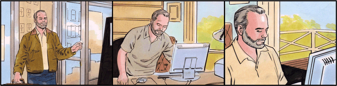
Image 1: Using a series of comic frames sequentially helps illustrate the progression of time. (Click to enlarge.)
Comics can also easily illustrate a user’s response to an onscreen interaction. A flow diagram with an end error state or confirmation message may require the reader to decipher it, but the comic character’s facial expression can clearly reflect frustration or pleasure (see image 2) with a specific computer interaction. Using characters in your comic forces you to focus on the user experience implications of design decisions, one of the basics of a user centered design (UCD) approach.
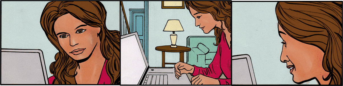
Image 2: A user’s satisfaction/dissatisfaction with the outcome of a specific computer interaction can be illustrated using facial expressions. (Click to enlarge.)
Screenshots of user interface (UI) elements can also be incorporated into comic frames (see image 3) to give readers additional insight into the user’s experience. When presenting comics and page elements, this approach allows your audience to provide timely feedback on a screenshot, low fidelity prototype, or wireframe while understanding a page element in a greater context.
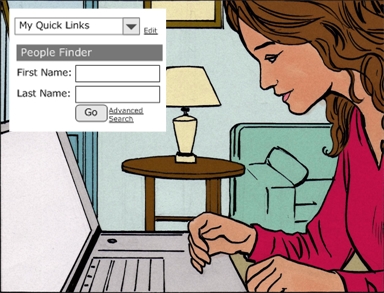
Image 3: Including wireframe or screenshot functionality in a series of sequential comic frames communicates the context for interaction.
How do you use comics to explain user experience?
Here’s how we made it work:
Step 1: Focus on the point (forget the details)
I was already well aware of our key scenarios and use cases, so I crafted brief stories in paragraph form for each one. Taking the time to write these stories before incorporating them into a comic allowed me to focus on the main points and the completeness of the message without the clutter of images and thought bubbles.
Step 2: Go from script to strip
I then thought through how to logically translate each scenario-based vignette into a series of frames. Each frame needed to communicate a key action or thought process in the scenario. To do this I created empty square frames and pasted in portions of my story in each.
Step 3: Fill in the details
With the outline of my comic strip completed, I was ready to start filling in the details. Based on what I’d learned from Kevin Cheng1 and others2, I knew I really didn’t need a lot of different designs, just a few varying facial expressions and illustrations of individuals at computers. With help from Microsoft’s Clip Art Gallery Live and a thought bubble tactic from Dan Brown, I added my characters and text. Finally, I carefully selected elements from the wireframes to incorporate. It looked something like image 4.
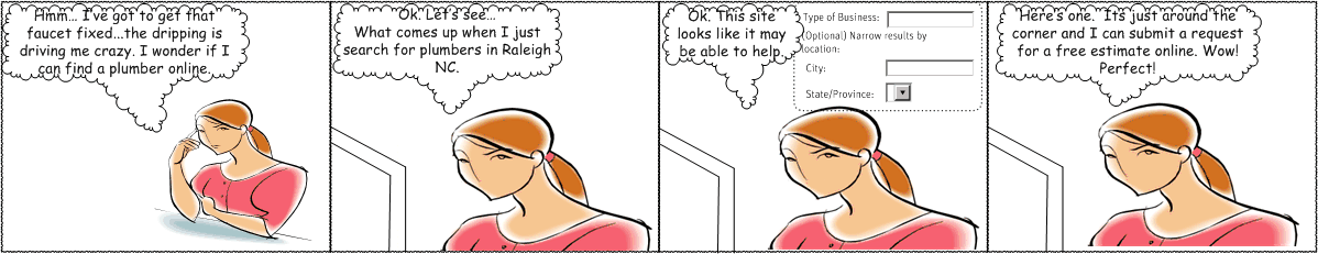
Image 4: Draft version of a scenario-based comic. (Click to enlarge.)
While no work of artistic mastery, the rudimentary sequential frames were easy to follow and communicated how an external user would move through the website.
At this point, we could have decided to intersperse the visual design screenshots with the comic strips for the presentation. However, our creative and interactive directors decided to have the comics turned into cartoons, which included having them professionally drawn and voiced and the still frame transitions animated.
So, I completed five or more comic strips for the most common website scenarios. Each frame was then pasted into a storyboard that captured the audio content to support it. The storyboard also captured when and where the visual design screenshots would be incorporated into each story.
Shortly thereafter, the transitions between the individual comic frames were animated and interspersed with the visual designs to show not only what the site would look like but also how users would interact with it. The animated transitions also showed how administrators would manage and create the sites in the CMS.
The presentation successfully communicated how users would engage with the site in addition to how it would look. Audience members commented on the use of comics as “a really cool way to demonstrate functionality.” While the team also got a few “how did they do that?” responses, others mentioned how easy it was to understand the process with comics. Using comics, we were able to quickly communicate complex concepts to a large, diverse audience. The comic medium also allowed us to illustrate answers to many of the audience’s questions before getting to the Q&A session.
A bonus of the project: I now have a generic Visio template that includes comics that I can reuse for future projects. (Download it here.) When using the professionally-created frames in Visio3, remember that you can create your own comics using hand-drawn art or clip art.
It’s not the technical skill of the drawing that matters; rather, it’s the essence of what is being communicated. Be it wireframes, use cases, or scenarios, the comic strip is merely a vehicle that allows you to communicate your work effectively and powerfully.
1Kevin Cheng, Communicating Concepts through Comics.
2Carson Van Osten, Comic Strip Artist’s Kit
3To use this template in Visio, download it to your “My Shapes” folder. It should then appear in Visio under Files > Shapes > My Shapes.
We use comics at Sun for a variety of web design and customer experience projects, and we have posted a set of illustrated scenes and characters to you use at: designcomics.org We’ve placed these images into the public domain so you can use them as you will.
– Martin Hardee
I have been drawing comics since middle school, so it was a natural tool for me when I started UX work back in the dark ages before all the normal techniques kind of standardized themselves. In the first shop I worked in, we also did a lot of simplified comic-styled versions of on-screen UIs. While I like the comic format for presentations, I find a traditional storyboard format better for me as a daily tool. It contains more information, but it’s still accessible to non-technical audiences. It was the absolute best option when doing work for Disney too (of course).
In a client role, I would be tickled pink to get information presented in this manner!
I hope everyone using comics chimes in so I can steal ideas.
Using comics to storyboard to explain UX is only a step away from using comics as user guides. (Slight tangent but I haven’t seen this discussed anywhere.)
In the 1990s, when I worked for the provincial Legal Aid agency, we produced “how to” comic books for First Nations communities (equivalent of “Native American” communities) to communicate what to do in common legal situations where people might not qualify for legal aid but may not be able to afford a lawyer. The comic books were very well received, because they were seen as relevant due to their cultural specificity, and the advantage was that we reached a vulnerable audience whose literacy skills may not have allowed them to slog through a traditional booklet on “legal options after spousal abuse” or “legal recourse after removal of your children”.
Like using comics for UX work, comics are an economical and evocative way to explain complex topics at a glance. Putting the amount of information we got into an 8- or 12-page comic was an incredibly effective way of communicating not just the technical info, but also communicating mountains of contextual info that would never have made its way into any other textual or graphic (as in Visio) representation of a process.
Here’s a range of (single and multi-panel) examples:
http://www.1-900-870-6235.com/eLearning/Images/eLearningMapCartoon.jpg
http://www.1-900-870-6235.com/Images/RWMapCartoonPrint.jpg
http://www.1-900-870-6235.com/Images/DividingLineCartoon.jpg
http://www.1-900-870-6235.com/Images/FlagOnMoon.jpg
http://www.1-900-870-6235.com/Images/TornMapReaders.jpg
http://www.1-900-870-6235.com/Images/PeaceGames.jpg
Here’s another example of using a comic to convey important ideas. After writing a series of articles for the DoD’s technology development journal, my colleagues and I put together a 2-page superhero-style comic to literally illustrate the concepts. We wanted to get the attention of people who typically don’t read journal articles, and the response was fantastic.
You can see the PDF of the comic at http://www.dau.mil/pubs/dam/03_04_2006/fist_ma06.pdf.
In a recent scenario / storyboard we used some team members as actors and did informal photo-shoots, then used Photoshop filters to blur them so that they were less detailed (and less distracting from the actual story). It actually worked really well!
I am very impressed and loved your thought process to use comics to communicate design. Really innovative and engaging. And thanks Rebekah for sharing the visio stensil.
Art Spiegelman (following Will Eisner) prefers the term sequential art to the mildly pejorative comics. When seen as sequential art, comics seem a logical avenue for exploring and communicating user experience. Further, the visual language of comics can be helpful when it comes to actually designing interfaces and organizing information.
So it’s great to see that the idea is catching on! I’m tired of explaining that my piles of comics are part of an ongoing research project.
Hmm, I’m having quite a few, duh-why-didn’t-I-think-of-that moments reading this article and the great comments. I’ve thought though ideas in a storyboarding format before, but demonstrating the actual persons in different scenarios makes a ton of sense. Especially when persuading upper management, a client, or even your teammates to go with an idea. Interestingly, I rediscovered an application that came with my MacBook Pro called “Comic Life” produced by http://plasq.com/
The important part of the process here though is not how to get down on paper, but rather, the process. Rebekah made the most important point in Step 1. The ideas need to be well-crafted and articulate first. Ensure that what is put in the final is only the essentials.
Another point some of the comments alluded to here, that since the practitioners of our discipline are sometimes stereotyped, using comic illustrations (sequential art) does help us break out of that a bit. One comment reminded me of how an art director at an agency who totally typified me as an un-creative because my role there was to produce IA docs. I get the sense that is kinda true for a lot the visual folks. Involving them in this aspect of strategy could really help build bridges in the agency environment.
Great help, Rebekah. Thanks for the sparks.
Just fyi that we’ve added a footnote to this story more clearly attributing Kevin Cheng’s fantastic “Communicating Concepts through Comics”:http://kevnull.com/creating-concepts-through-comics/ presentations. This story is a case study showing that these ideas work. Nice work, Rebekah, and thanks to Kevin for spreading the good word far and wide. We’re doing our best to help that along.
Rebekah, thanks for the fantastic article. I especially looking to utilize this idea in proposals. So often a proposal is passed around internally by a corporation without you having the benefit to explain certain items. Comics appear to be a perfect way to make sure that all stakeholders have a clear idea of what the end user experience will be.
its called storyboarding people!
This article really strikes home. “Understanding Comics” is one of my favorite books on media and perception. I remember my first week at Sapient as an Information Architect in 1999, having arrived from a corporate setting. There was a Vitamin Shoppe deliverable on the table in the kitchen, and it made extensive use of comic-based user scenarios. I thought, “We’re not in Kansas anymore, Toto!” I saw a lot more creative web work in the ensuing projects, with new thinking about everyday life tasks. After the bubble burst and 9/11, and starting my own company, it seems that a seriousness set in, that unless you’re working with a media or creative company, it’s all button-down standard IA deliverables, in shades of gray. I frankly don’t think I would have the nerve to propose or submit deliverables that use comics, unless the project sponsor was a think-outside-the-box communicator. So I’d be interested, Rebekah, if you would post a comment about which types of clients you think this approach would be most appropriate for.
Great question Paul. I think the context and situation should dictate the method more than the client type. We’ve had institutional and government clients that couldn’t understand a wireframe whereas some of our more “creative” and open clients had no trouble following site flows, maps, or scenarios. Rather than using comics for every engagement, I like to think of comics as a tool in my UX backpocket that I can pull out and use when needed.
@Paul, Rebekah,
Don’t forget that there is no one single asthetic for all comics. Visual explanations are not in and of themselves “creative” or “juvenille”–they’ve been around longer than language! The real trick is ensuring that the visual aesthetic that you choose is one that matches your client’s business culture. The more hip companies can deal with comics that really look like comics, but anyone at even IBM or ChaseMorgan will appreciate elegant visual explanations. Just compare the visual style of Xplane [http://www.xplane.com/#/publications/] with Tufte [http://www.edwardtufte.com/tufte/fineart] and you’ll see what I mean.
Visual explanations (including comics) work because they are not as linear as language and don’t need as much processing. More dimensions of information can be made available to the viewer simultaneously and that can often mean the difference between an immediate understanding and more rounds of explanation. I actually at one time won a systems contract with a single piece of paper [http://www.troped.com/design/MBL002/index.html]. Simplicity is elegance.
Rebekah, already I’ve had cause to refer this as a link to a creative director and IA…so thank you.
One other thought I just had is that this could be a nice presentation output following a user think-aloud exercise: “I want to…so I can…”.
If this was presented back to stakeholders in comic book form it provides fodder for feature refinement that informs an initial prototype or more detailed user flow.
As a comic/whimsical illustrator for over 10 year, its refreshing to a renewed interest in comic-style for communication purposes. I also agree with Paul, that since 9/11, business has been very “buttoned-up”, but I think that is starting to teeter — finally. I still find a effective way of addressing serious issues without being over-the-top in your face. Thanks Rebekah!
For those of you who want that classic comic-look for your word balloons, I’ve posted a new shape on the Visio Guy website. You can read about, and download a nice, oval-shaped world balloon, with a tail that can be moved to any position!
Get it here:
Word Balloon Shape
http://www.visguy.com/2008/05/29/word-balloon-shape
A great way to create your own user experience comics is to use the comic creator tool at bitstrips.com. We used this to put together our popular usability test moderation instruction guide (at http://www.userfocus.co.uk/articles/moderationcomic.html). Combined with a desktop tool like Comic Life, bitstrips lets you create comics for almost any scenario.